GoodScore Design System
A unified system of foundations and components for a fintech app with 100+ screens. Designed and built solo in three weeks.
- 138 primitives
- 61 semantic tokens
- 21 text styles
- 37 components
- 454 variants
- 132 icons
A unified system of reusable foundations and components that brings clarity, consistency and structure to every GoodScore screen.
Colour system
Primitive ramps and semantic tokens, each with a job.
Typography
Inter, 21 styles in six groups.
Spacing & sizing
A 4 px scale and a 48 px touch target.
Corner radius
Six sizes that grow with the element.
Elevation
Six levels mapped to nine roles.
Icons
132 Material Symbols in four sizes.
Design tokens
Colour, type, spacing
Atoms
Toggles, badges, icons
Molecules
Buttons, chips, inputs
Organisms
Rows, cards, steppers
Templates
App bar, sheets, modals
Pages
Home, Pay EMI, Credit Report
Built from the audit up
Each foundation below follows the same path: the challenge, the tests, the system, and the full scope of what shipped.
Colour system
A flexible palette of primitive and semantic colours that keeps every screen consistent, accessible and recognisably GoodScore.
The challenge
Colour had grown screen by screen. Nobody could say which blue was “the” blue, or whether text on it was readable.
Tests we ran
Every round had to survive four tests on real components and screens before moving on.
The system
Two layers. Primitives hold raw values; semantic tokens give each colour a job. Components only ever use the job.
#008EFE lives at blue/500, untouched. Buttons use 600, links 700.
Every hue shares it, so any step means the same strength.
text/neutral/primary · bg/danger/subtle · border/brand/default
Green done · yellow attention · orange warning · red risk. Blue is never a status.
Full scope
Everything that shipped: 9 ramps × 15 steps, 61 semantic tokens and a contrast check for every pairing.
Typography
Text styles as design tokens: one typeface, three weights and twenty-one styles, each named for the job it does.
The challenge
The old styles had been converted, copied and renamed until nobody trusted them.
Tests we ran
Five tests on real text and the live library. Two of them found things I still had to fix.
The system
Kept Inter. Rebuilt everything around it.
Three weights, three jobs
400 for reading, 600 for interface, 700 for emphasis and amounts.
Every line on a 4 px grid
Line heights 16 · 20 · 24 · 28 · 32 · 36 · 40 · 48 · 56. Text lines up with spacing.
A Number group for money
Tabular figures, so amounts line up on every screen.
Named by job
Role/Size, readable in any Figma panel.
11 px minimum
10 px removed. Caps only for Overline, at +6% tracking.
Full scope
All 21 styles, each a design token with size, line height, weight and tracking.
Spacing & sizing
One 4 px scale for every gap, and size tokens so a 48 px tap area is never a guess.
The challenge
Every gap looked fine on its own. Side by side, screens felt slightly off.
Tests we ran
Measured on the live library, not eyeballed.
The system
Closer means related. Distance shows structure.
Full scope
12 spacing tokens and the size tokens components share.
Corner radius
Six sizes that grow with the element: crisp small controls, soft large containers.
The challenge
19 different corner radii, from 1 px to 678 px, chosen screen by screen.
Tests we ran
Log in again to continue.
Log inThe system
Bigger thing, rounder corner. Inner radius is outer minus padding.
Full scope
Six tokens, and the components that use each one.
Elevation
Shadows that show what sits on top of what. Six levels, nine roles, one shadow colour.
The challenge
Shadows were picked by eye, in pure black, and tested on white.
Tests we ran
Every shadow tested where it will actually live: on real colours and real components.
The system
Two layers per level: a tight key shadow for the edge, a wide ambient one for lift. Components use roles, never levels.
Sticky CTA bar · bottom nav · bottom sheet
Full scope
Six levels and the nine roles that point at them.
132 icons
Material Symbols, the set Android users already know. Four sizes, colour from text tokens.
The challenge
Icons were imported one by one, at random sizes and colours.
Tests we ran
The system
Familiar over clever. Icons support words. Colour comes from the text beside it.
24 px glyph · 48 px target
Full scope
Every icon in the library, named to match Material Symbols so developers find the same one in code.
Simple components
The building blocks: buttons, inputs, badges, chips and toggles. Small, strict, and reused everywhere.
Buttons
Six types, three sizes, five states. One component, 90 variants. Blue only ever means “do something”.
States & variants
Every type in every state. Pressed and Focus were added after review.
Inputs
Text, amount and OTP fields. Money gets its own field: ₹ prefix, Indian grouping and an optional period suffix.
Badges
Six statuses, each with exactly one meaning. Subtle for lists and cards; Expressive for the one status that matters most.
And the rest
Small parts, built in full: every variant, state and property, with one rule each.
Complex components
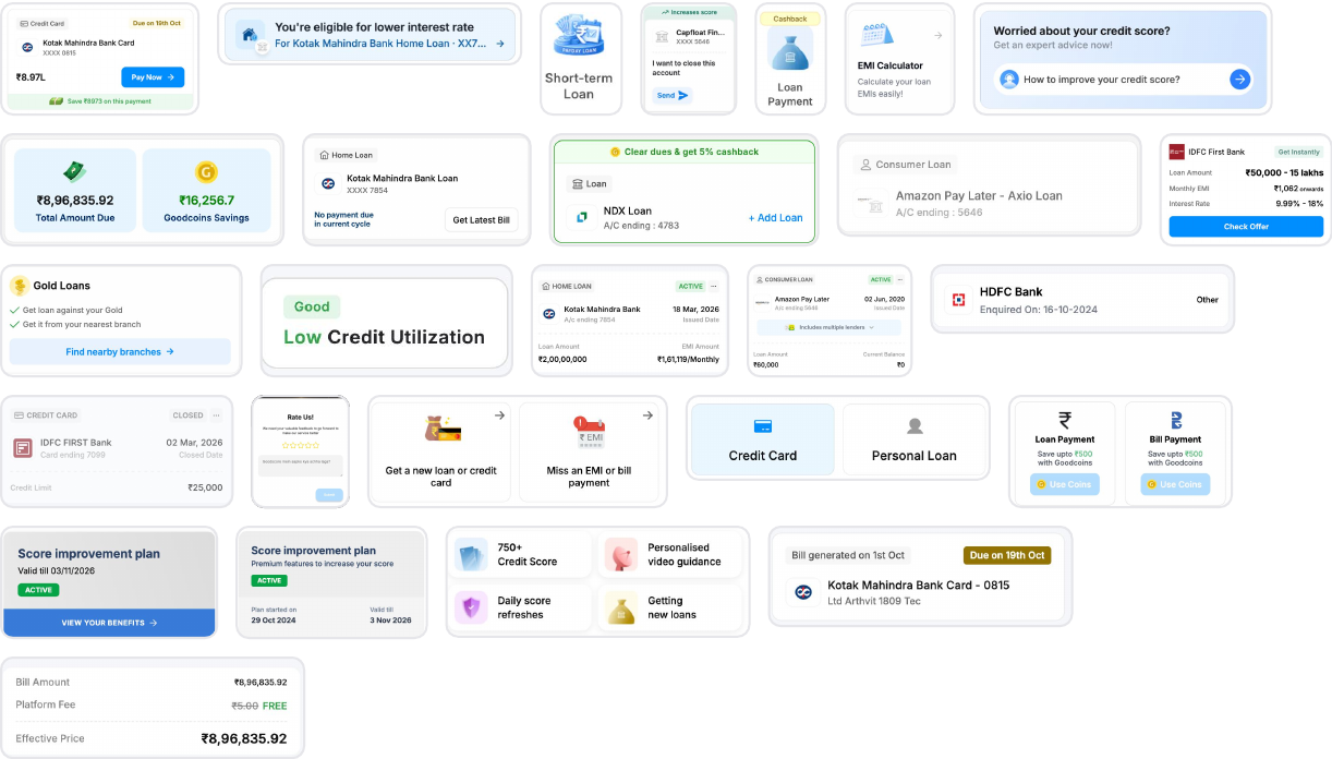
Rows, cards, app bars, sheets and modals. Built from the simple parts, so a fix in one place reaches every screen.
The challenge
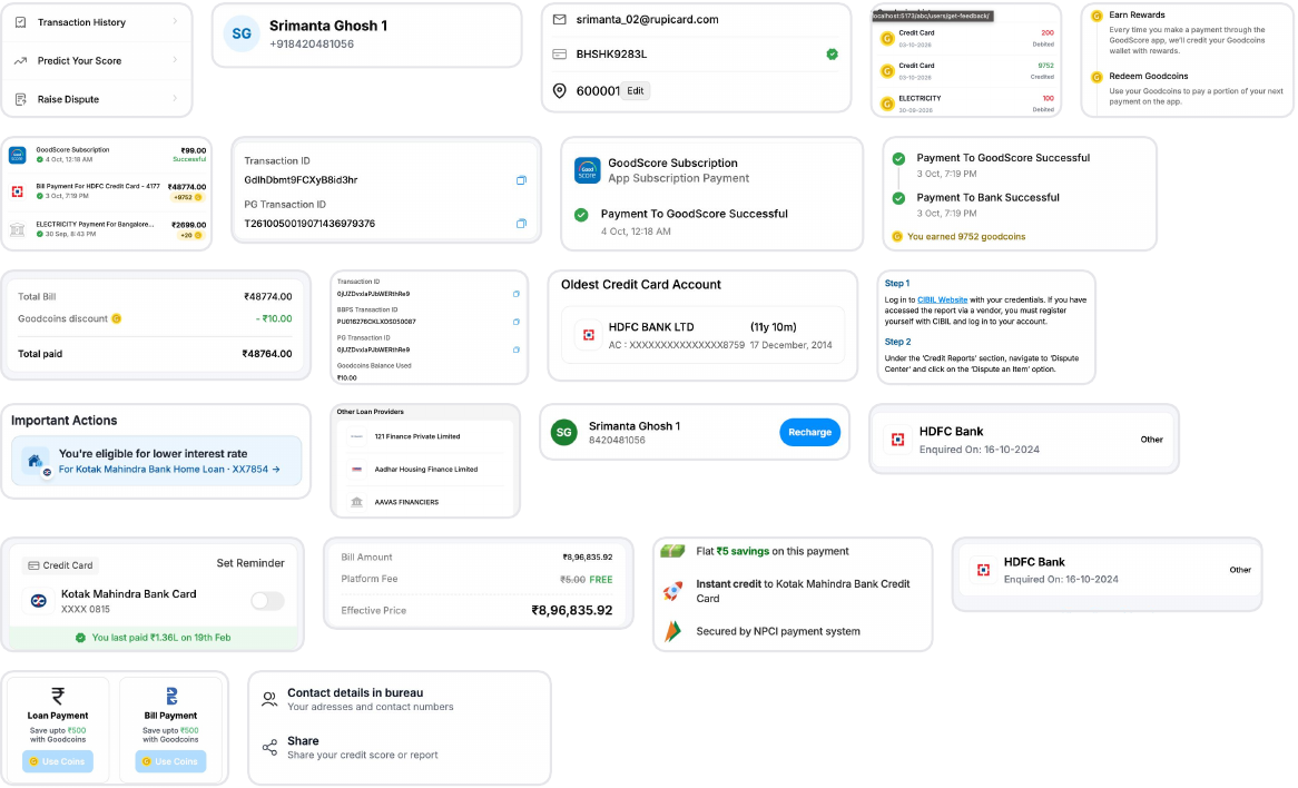
The audit found the same jobs drawn many different ways, each one made for a single screen.
Tests we ran
A component was done only when it rebuilt a real screen from the audit, with no detached layers and no raw values.
The system
Flexibility from properties and slots, not from more components.
1Top strip · optional status
2Content slot · any rows
3Bottom strip · optional note
Cards
One Card shell with two slots, four appearances and optional status strips. Every product card is built on it, so they all share the same edges, padding and elevation.
Full scope
Every component set in the library, with its variant count.
Shared infrastructure
From isolated decisions to one language for design and engineering.
Reusing components in new work
Building the library and tokens into code
Thank you.